Moving analytics out of the dashboard and into the classroom
class.com
I redesigned class.com’s analytics experience to fit how instructors actually teach, turning underused reporting into clearer actionable insights before, during, and after live sessions.
Some details have been modified to protect confidentiality.
↓

Did you know? Homework was reportedly invented by Italian educator Roberto Nevilis in 1905 as a form of punishment.
Background
Analytics were strategically important to both instructional quality and enterprise growth, but class.com’s original dashboard had not earned instructor trust or attention.
class.com is a Zoom-based virtual classroom platform used across K–12, higher education, and corporate training. When its analytics dashboard was taken offline due to data accuracy and accessibility concerns, it exposed a broader gap: the MVP experience wasn't working for instructors, and that had real consequences for both teaching quality and enterprise credibility. The outage created the opportunity to rebuild analytics the right way, and I led the product design decisions that shaped the rebuild.
Role
Lead UI/UX designer
Focus
Dashboard redesign, UX research, usability testing
Partners
1 PM, 3 engineering pods, educator and corporate training stakeholders
Impact
15% increase in feature usage, 82 SUS, 4.3 / 5 CSAT

Built on top of Zoom, class.com layers teaching tools directly into a live virtual classroom experience. For instructors, every moment of class involved competing priorities. Any analytics experience had to work within that limited attention, not outside it.
Challenge
The dashboard delivered plenty of data, but not in a way instructors could use in the moments that mattered.
Instructors were simultaneously teaching, monitoring students, and managing class flow, leaving almost no capacity to interpret a dense, separate interface. Important signals got missed. Insights arrived too late. And the value of analytics remained unclear to both instructors and prospective customers.
The problem wasn't a lack of data. It was analytics that didn't fit how instructors actually worked.
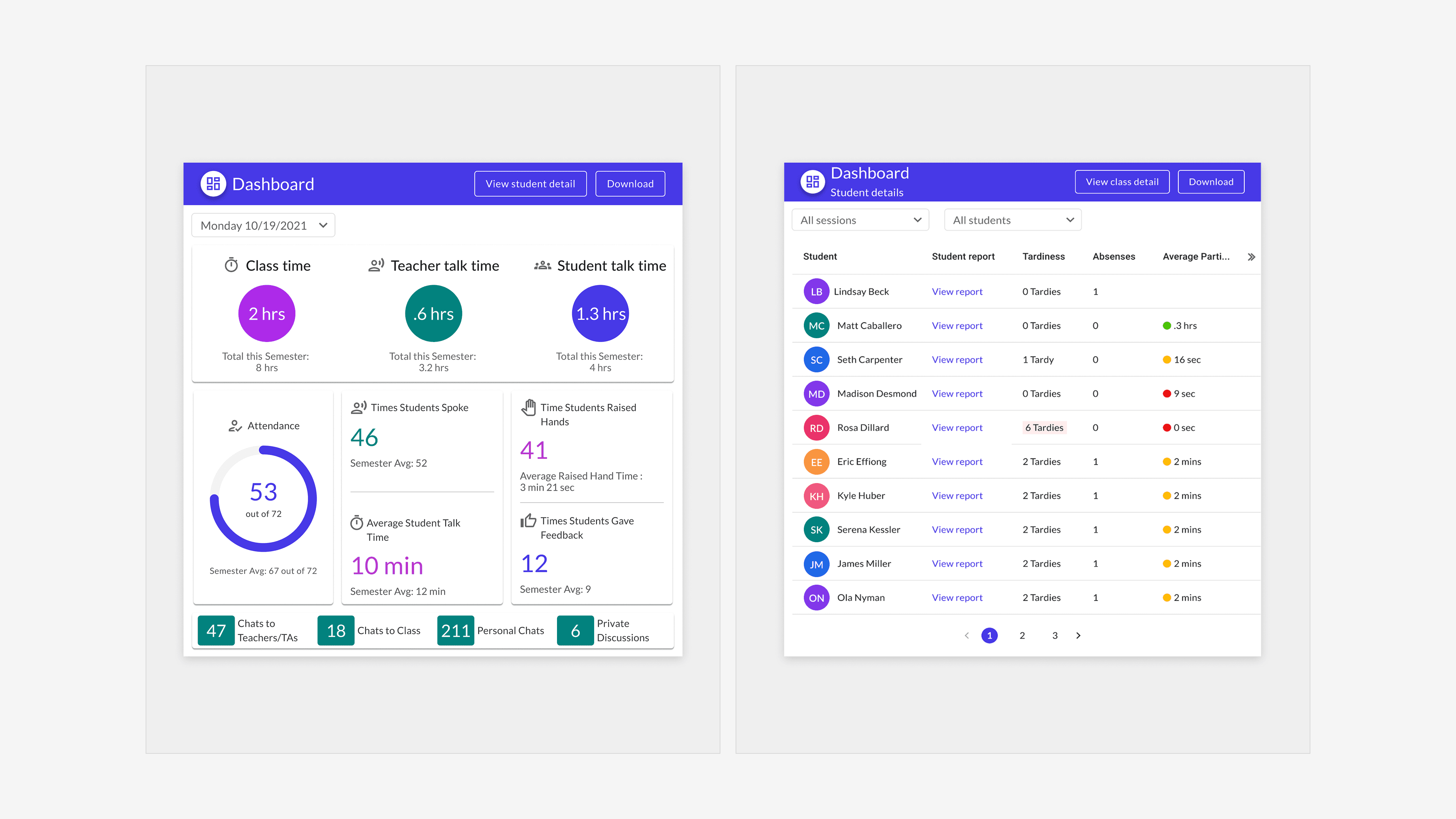
The original dashboard surfaced extensive classroom data, but split it across dense views that demanded attention instructors didn’t have during live teaching. Session metrics and student reports existed, but critical signals were difficult to scan quickly. Existing analytics competed with live classroom attention.
Insights
Analytics failed when they required heavy interpretation.
Even though 83% of instructors said analytics were important, usage stayed low because meaning wasn't obvious fast enough.
"We're teachers, not data scientists."
— K–12 teacherTrust in data is a prerequisite for adoption.
Instructors disengaged quickly when metrics seemed inconsistent or hard to verify. Even small doubts about accuracy made analytics feel not worth acting on, and ignored data is the same as no data.
If I can't explain to a student why their engagement score is what it is, I don't want to show it to them.
— K–12 teacher
The dashboard model existed in the wrong place and time.
Instructors rarely consulted analytics during live sessions because their attention was fully on teaching. One corporate instructor noted she hadn't even known class.com collected analytics at all, a sign the feature had never been integrated into the workflow it was meant to support.
100% of instructors interviewed confirmed they never consulted analytics mid-session.
Design
Analytics only work if they fit inside the moment they're meant to support.
Rather than asking instructors to navigate a separate dashboard mid-class, critical signals like attendance and engagement were embedded directly into the classroom interface where their attention already was.
Outside of live sessions, the dashboard was redesigned for pre- and post-session preparation and reflection.
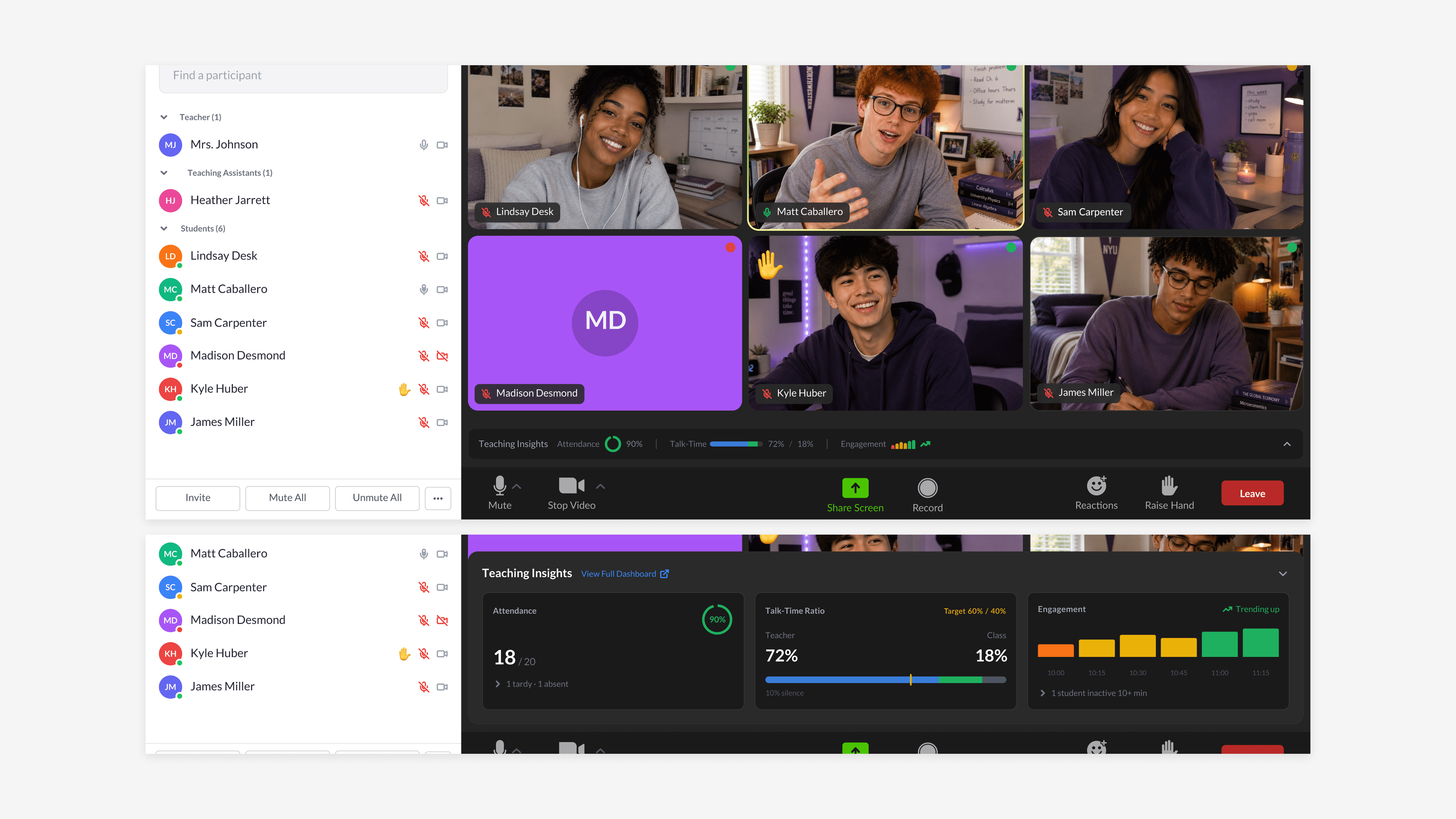
Bottom: Expanded teaching insights for deeper analysis. Top: Collapsed to minimize distractions. Core teaching insights including attendance, engagement, and teacher talk time surfaced directly within the classroom, allowing instructors to easily monitor high-priority metrics in real time.
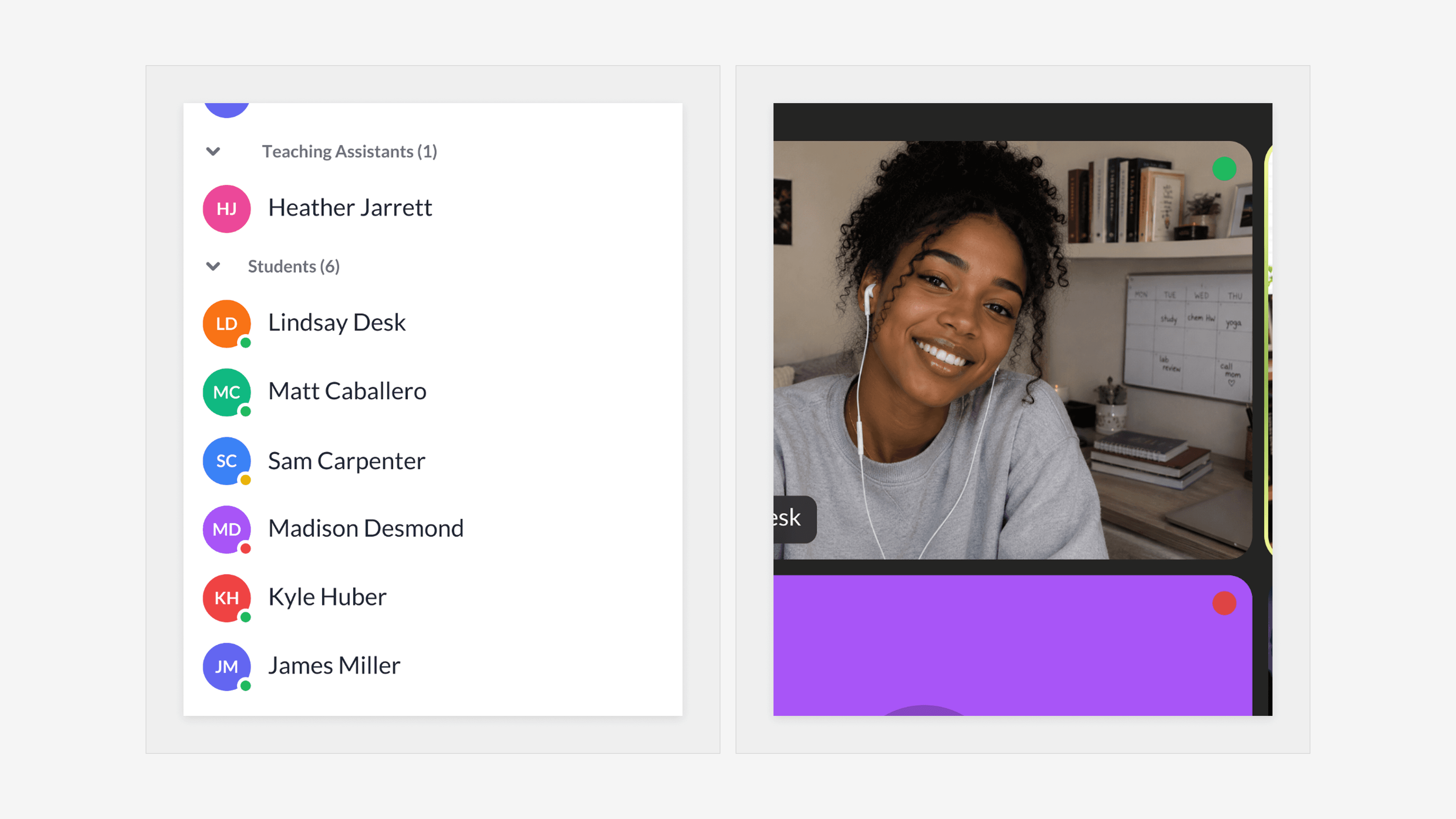
Left: Engagement visibility within the roster on students' avatars. Right: Real-time indicators also embedded into video tiles. Participation cues were integrated directly into the classroom environment where teachers were already focused, helping them monitor engagement and identify students who may need support without interrupting instruction or navigating to a denser analytics dashboard.
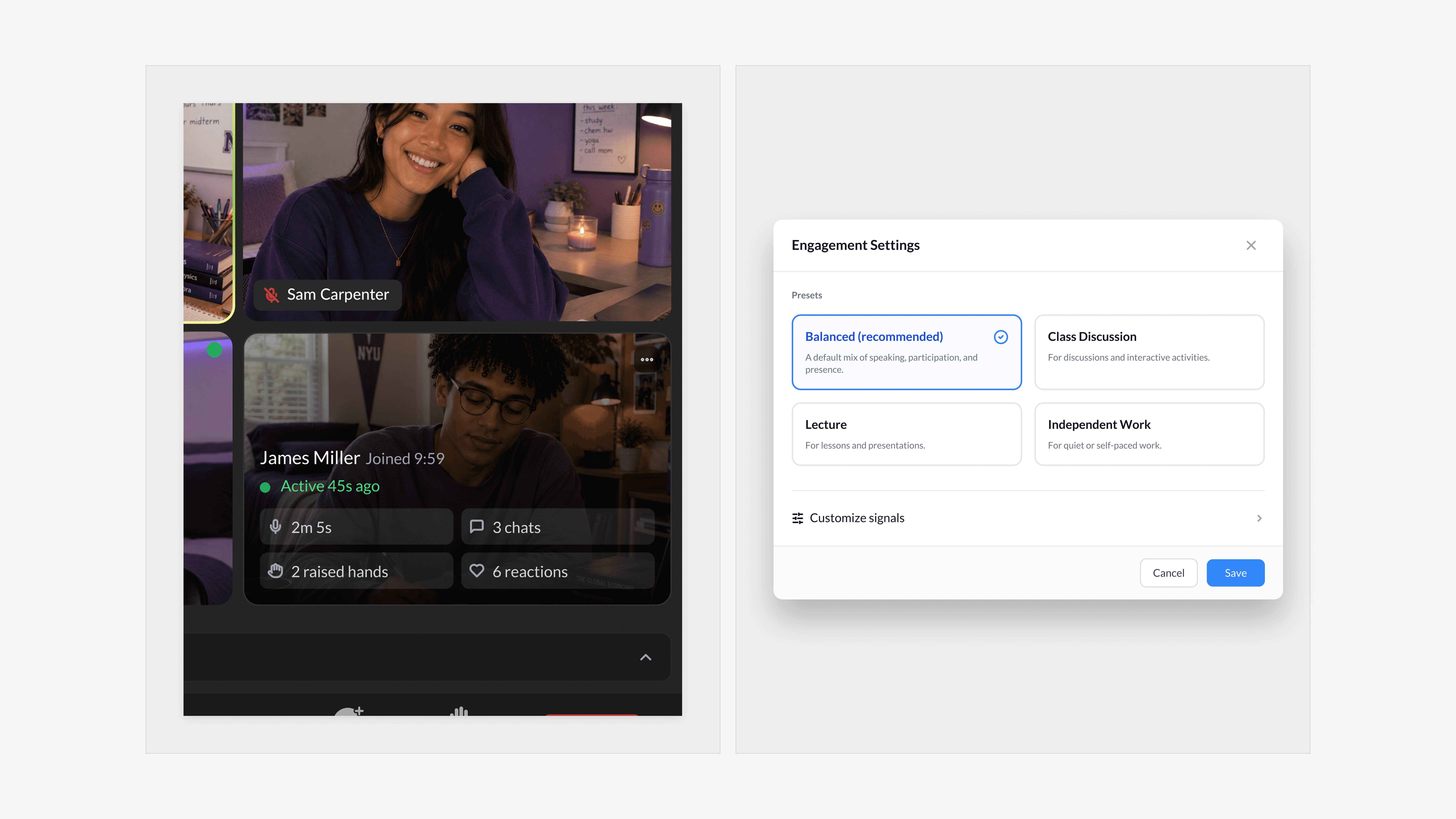
Left: Student analytics revealed on hover. Right: Customizable engagement settings. An on-demand student snapshot and configurable engagement settings gave teachers greater flexibility in how classroom activity was monitored, interpreted, and surfaced during live instruction.
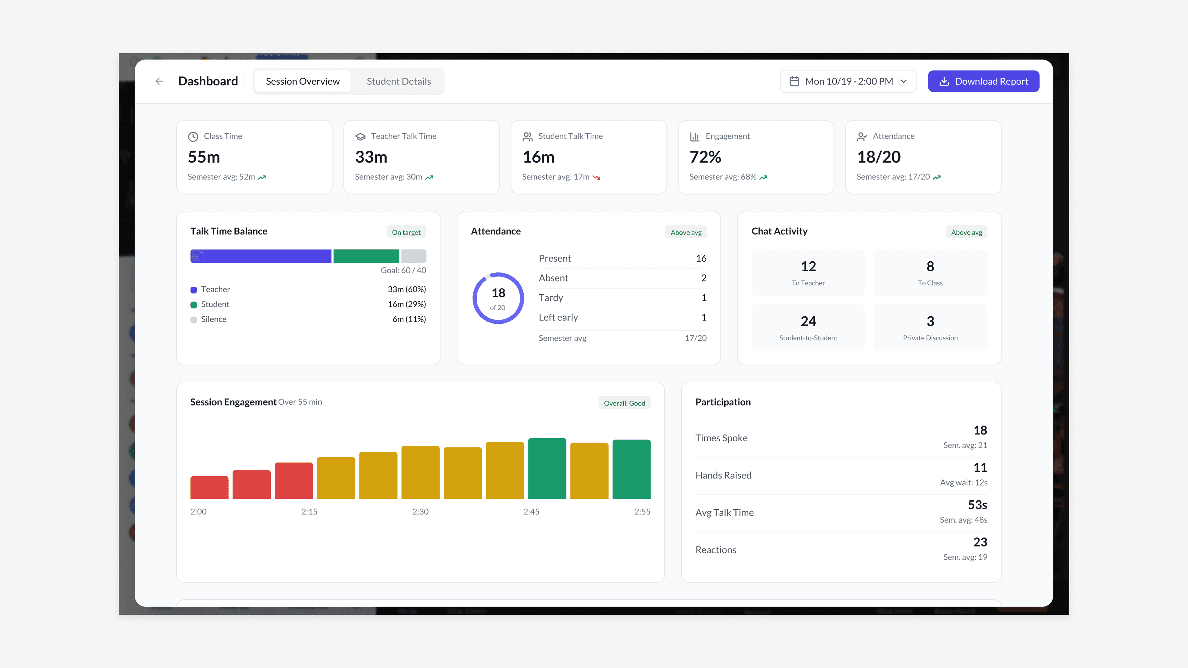
The redesigned session overview brought better organization to high-priority signals like talk time, engagement, and attendance.
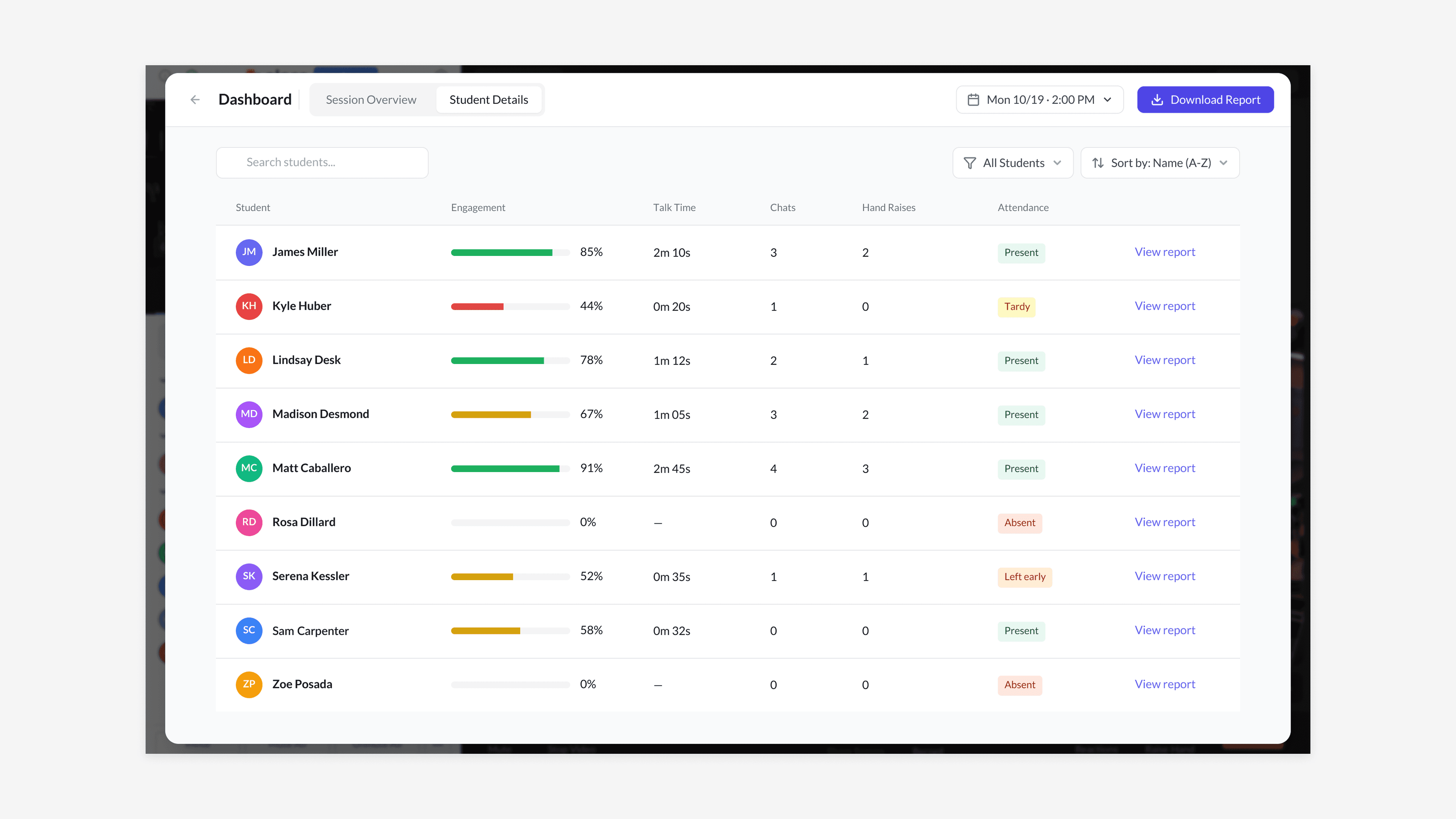
Student details were redesigned to make engagement patterns, attendance behaviors, and classroom activity easier to scan, interpret, and act on.
Outcomes
15% increase in feature usage
Critical insight access reduced from 3 steps to 1
82 SUS
4.3 / 5 CSAT
Contributed to $250K in pending contracts by strengthening enterprise reporting readiness
The redesign improved analytics adoption by making important signals easier to reach, easier to trust, and easier to act on. The work reinforced that in live environments, analytics are most effective when they respect attention rather than compete with it.