Tiny tweaks, major revenue growth
Ticketmaster × PayPal
I redesigned how PayPal surfaced across Ticketmaster’s purchase funnel, increasing adoption while protecting conversion and upsell revenue in a high-volume checkout flow.
Some details have been modified to protect confidentiality.
↓
Did you know? Ticketmaster has been selling tickets since 1976, long before mainstream internet was around.
Background
PayPal’s reduced processing fees created a multimillion-dollar incentive to increase its adoption across Ticketmaster’s purchase funnel.
Ticketmaster has one of the highest-volume purchase funnels in live entertainment. Even small shifts in payment behavior can create millions in downstream impact.
As Ticketmaster’s preferred payment partner, PayPal negotiated increased visibility across the platform in exchange for reduced fees, making payment placement a strategic and measurable business priority. I was the designer responsible for working directly with PayPal.
Role
Lead product designer
Focus
UX research and strategy, interaction design, funnel optimization, testing, stakeholder alignment
Partners
PM, engineering, PayPal stakeholders
Impact
+11% adoption, −7% abandonment, +4% AOV
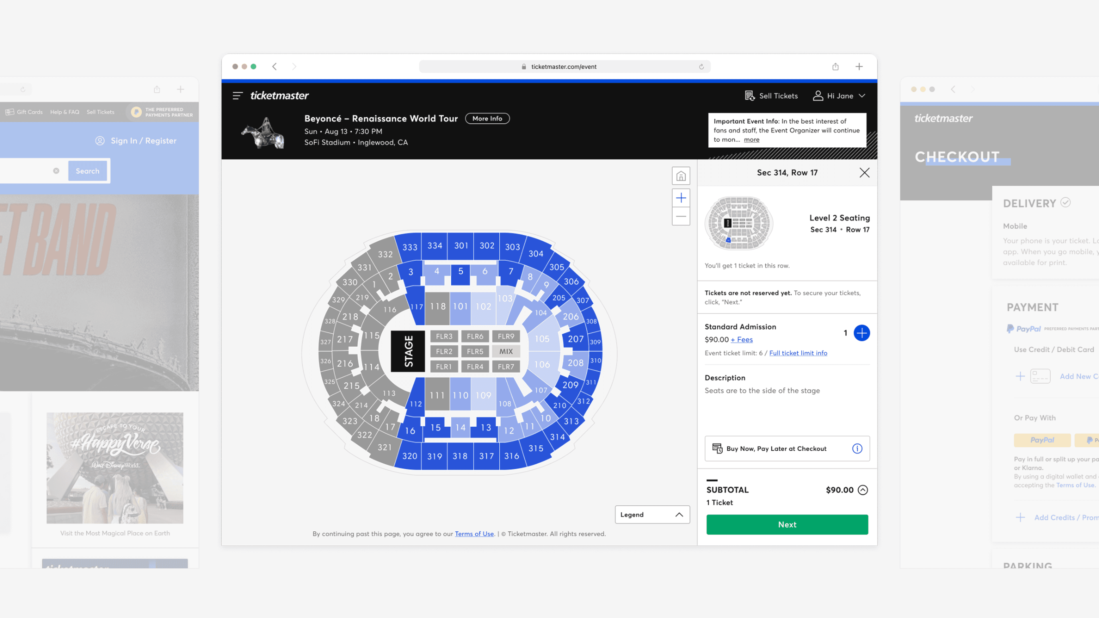
Users moved through three key moments in the purchase funnel: homepage entry, ticket and seat selection, and checkout.
Challenge
PayPal express checkout earlier in the funnel had already proven it could lift adoption, but at the cost of conversion and upsell revenue that leadership wasn't willing to lose again.
A previous redesign had moved PayPal express checkout earlier in the funnel, bypassing the standard flow to let users pay in fewer steps. Adoption went up, but overall conversion and upsell revenue fell. The gains didn't justify the trade.
Leadership locked the placement at ticket and seat selection based on those results. The goal wasn't to move it again — it was to reduce bounce without giving back what had already been won.
Any solution had to account for:
weakened checkout momentum
reduced upsell opportunity
legal and technical constraints around payment interactions
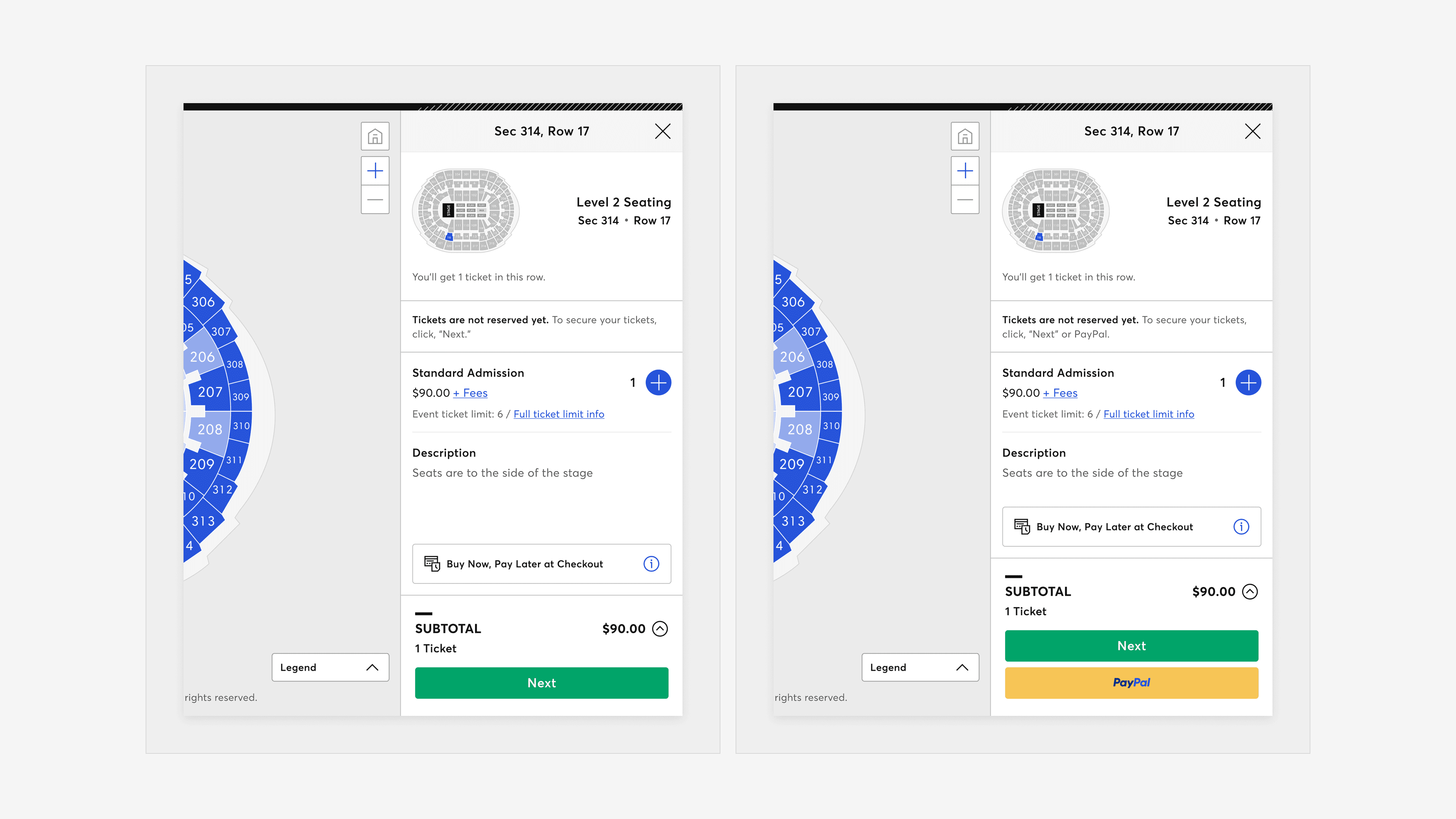
The control (left) vs. leadership's proposed variant (right). Moving PayPal earlier in the funnel increased adoption but came at the cost of overall conversion and upsell revenue.
Insights
Users needed cost certainty before committing to a payment method.
When interviewed, users reported that PayPal appearing before the total cost breakdown created hesitation rather than convenience.
75% wanted to review total fees before selecting a payment method.
Two equal CTAs created hesitation at a critical moment.
Presenting two actions at ticket and seat selection made users pause to evaluate which path felt safer, faster, or more expected.
“I wasn’t sure which one to pick. I had to stop and think about what the difference was.”
— Non-PayPal, desktop shopper“I didn’t want to choose the wrong thing.”
— PayPal, mobile shopper
Early PayPal signaled convenience to some but risk to others.
PayPal users saw express checkout as a fast and trustworthy shortcut, while non-PayPal users often perceived it as premature, worrying they’d be locked into their selection or charged immediately.
Design
Users were not struggling to complete checkout. They were struggling to feel confident. Placement wasn't the problem. Timing and intent were.
Rather than letting PayPal bypass the standard flow, I repositioned it as a secondary action at ticket and seat selection — visible, but not competing for attention. The tradeoff was intentional: a slower path in exchange for better momentum through checkout.
If a user selected PayPal at ticket and seat selection, that choice carried forward into checkout, surfacing PayPal as the only payment method with alternatives hidden behind a click to reduce distractions when purchase intent was highest.
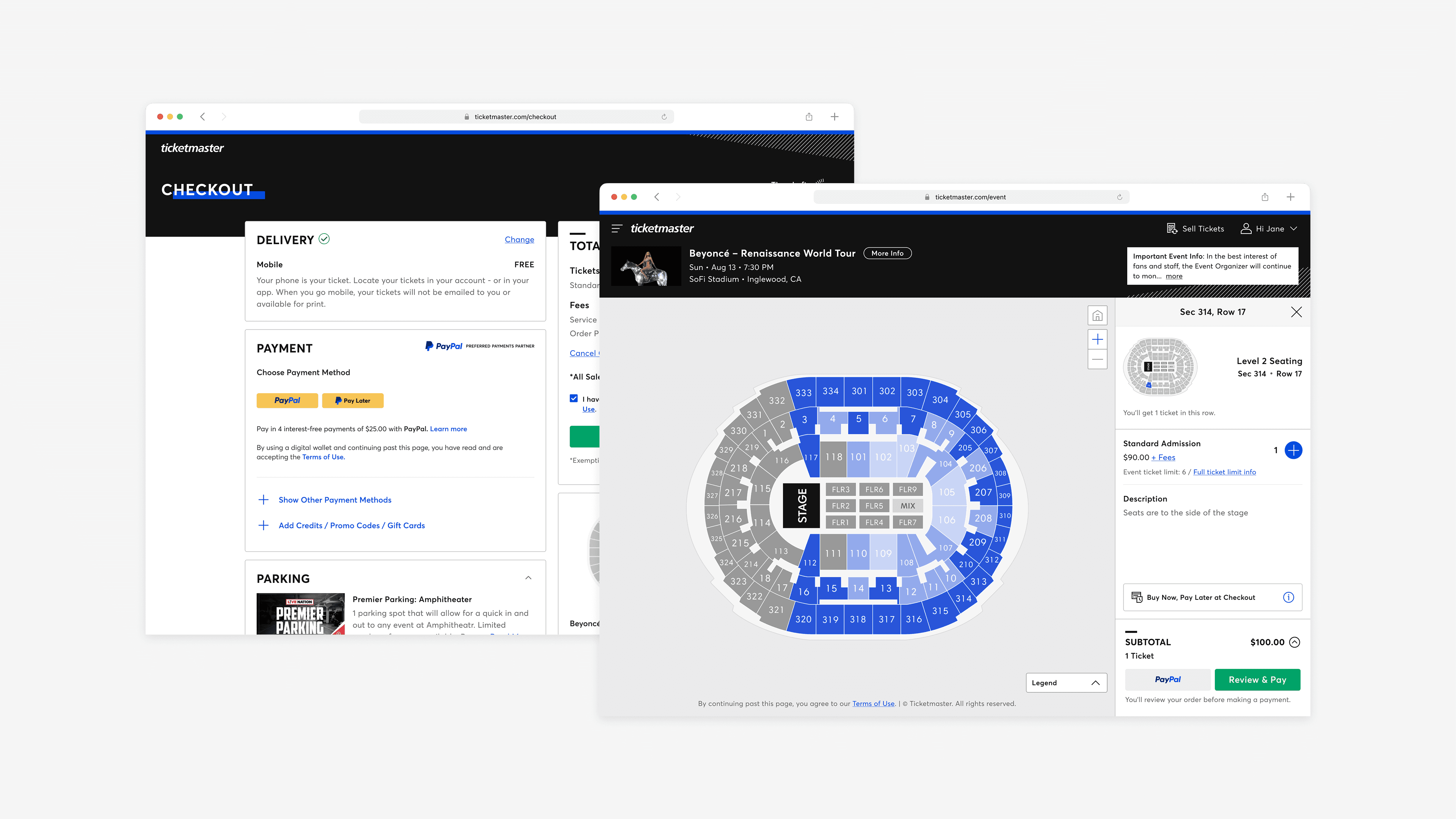
The final design introduced PayPal as a low-pressure secondary action during ticket and seat selection, funneling users into a checkout experience where it became the primary payment method when they were ready to pay.
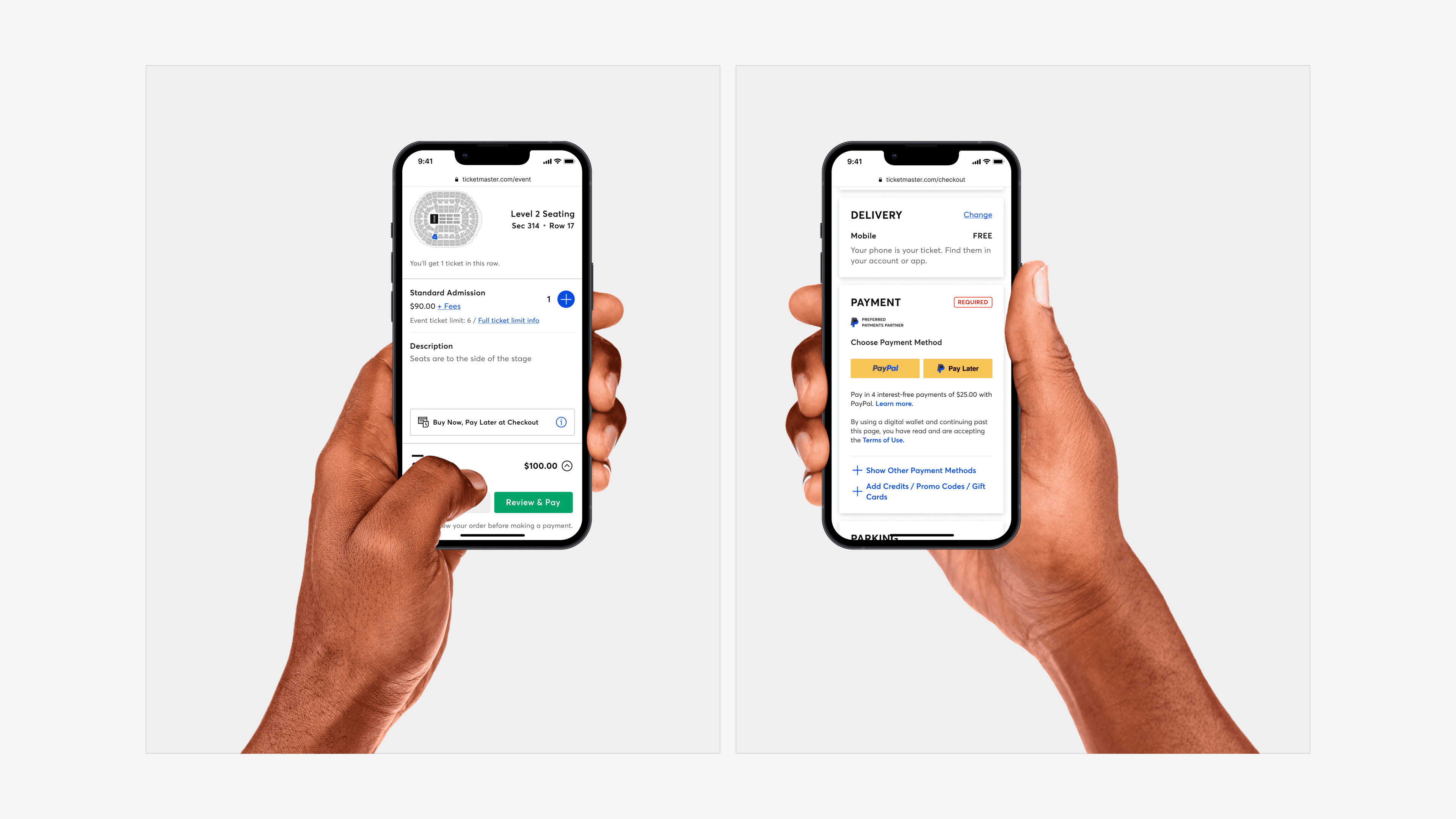
The same approach carried into mobile, where PayPal remained a secondary action early in the funnel before becoming the primary payment method at checkout.
Refinements
I validated interactions to reduce perceived commitment while preserving PayPal recognition and trust.
PayPal's signature yellow signals immediate payment to many users. A neutral button style preserved brand recognition without triggering the feeling of being locked in.
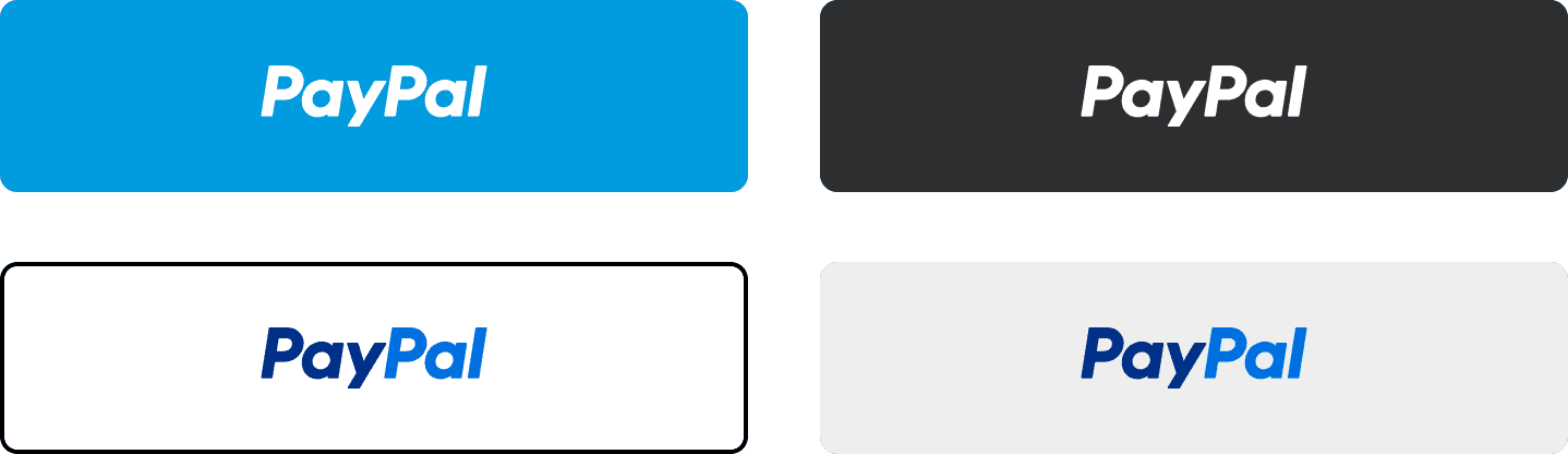
Before: 41% of users hesitated or found PayPal visually distracting. After: Hesitation dropped 24% once CTA hierarchy made the next step explicit.
The original button label, "Next," told users nothing about what came after. Clearer labels like "Review & Pay" and "Go To Checkout" set accurate expectations and reduced hesitation at the moment of commitment.
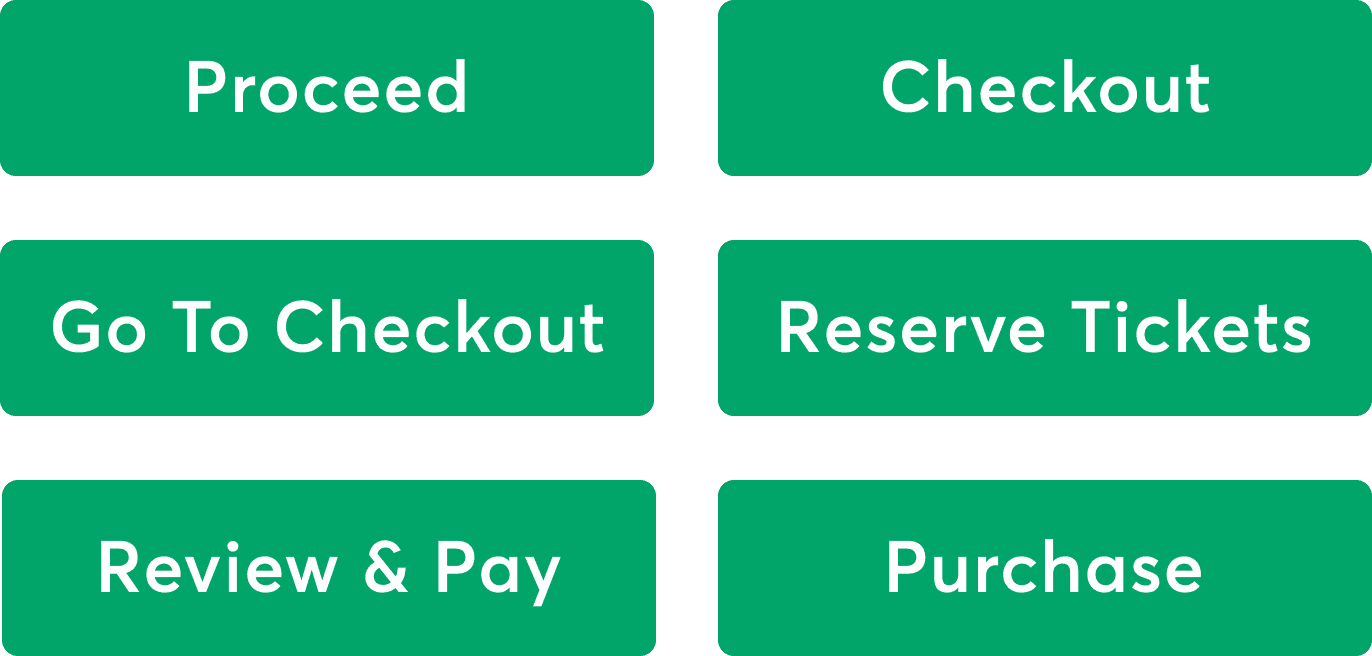
Users consistently preferred action-specific labels over "Next." "Review & Pay" and "Go To Checkout" scored highest for clarity, giving users a clear sense of what happened after they clicked.
A single line of copy near the PayPal button clarified that payment wouldn't happen immediately. Removing that uncertainty was enough to move users forward.
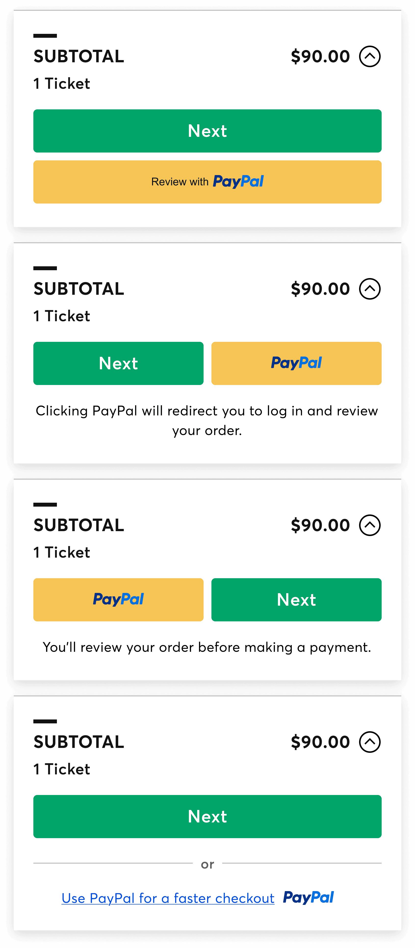
Variations explored button order, label placement, and inline microcopy to find the treatment that best reduced perceived commitment without losing PayPal recognition.
Outcomes
PayPal adoption increased 11%
Checkout abandonment dropped 7%
Average order value rose 4%
Met leadership goals and strengthened Ticketmaster-PayPal partnership
Introducing PayPal earlier improved a single metric in isolation, but at the expense of the broader funnel. The final design increased adoption while strengthening overall performance, showing that timing and framing matter more than visibility alone. In high-volume funnels, a payment option does more than enable a transaction. It signals readiness, trust, and intent. A button is never just a button.